Brief
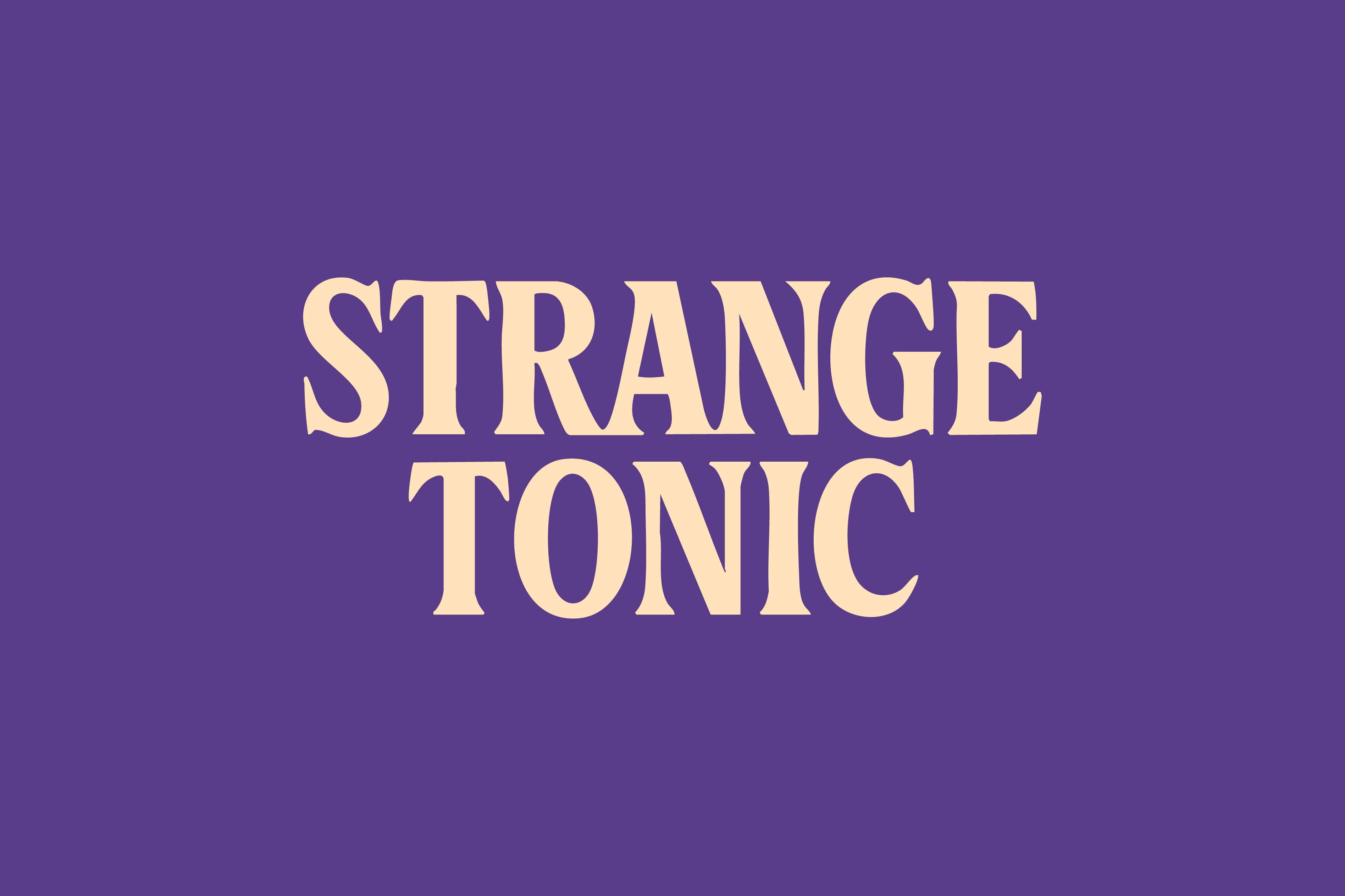
Strange Tonic is a Gen Z kombucha brand that
wanted to stand out from the health-first,
minimalist wellness category. The goal was to
rebrand kombucha as something expressive,
bold, and full of personality. It
needed to feel
more like an attitude than a beverage,
something that looked good on shelves, online,
and in your hand.
Idea
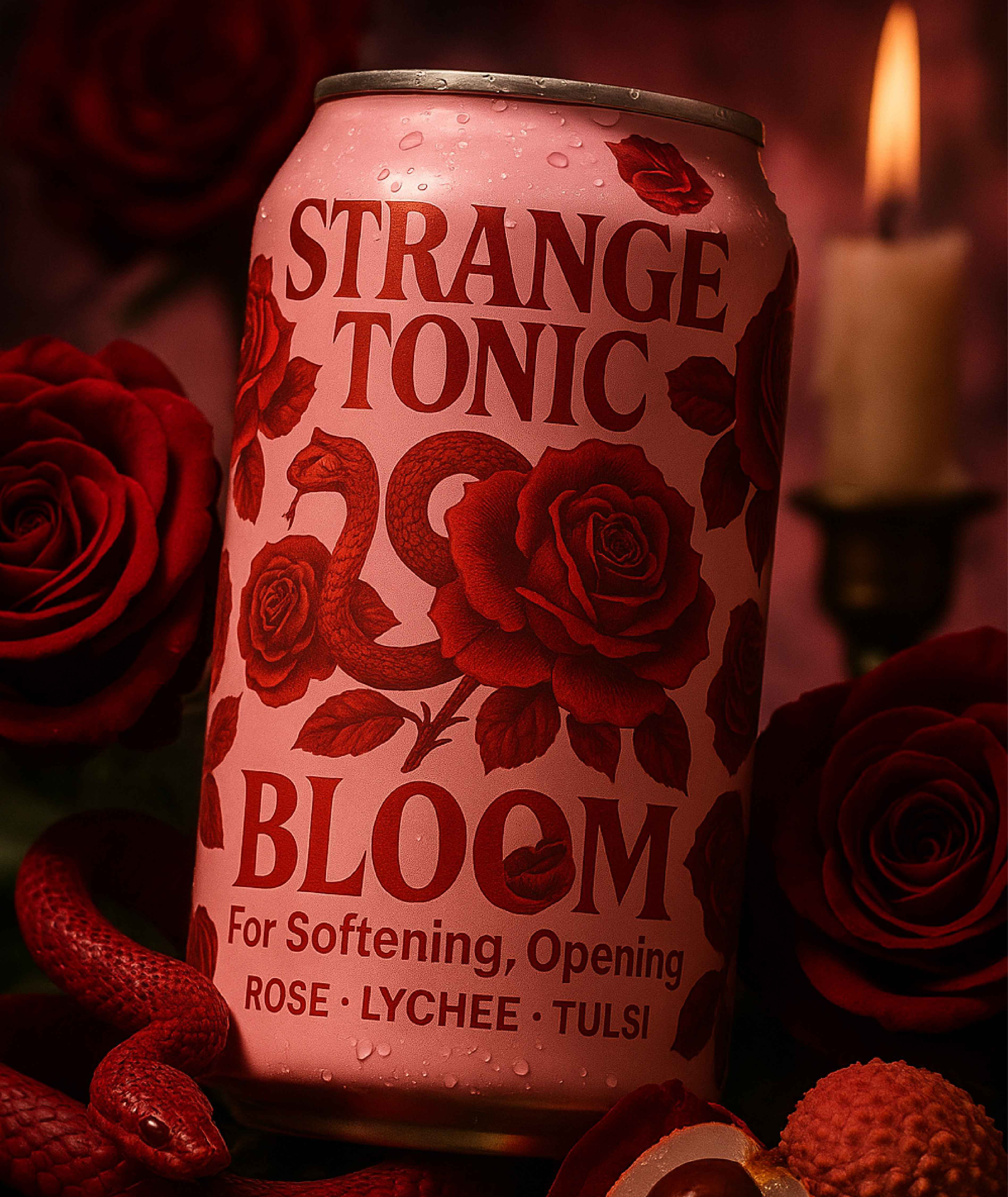
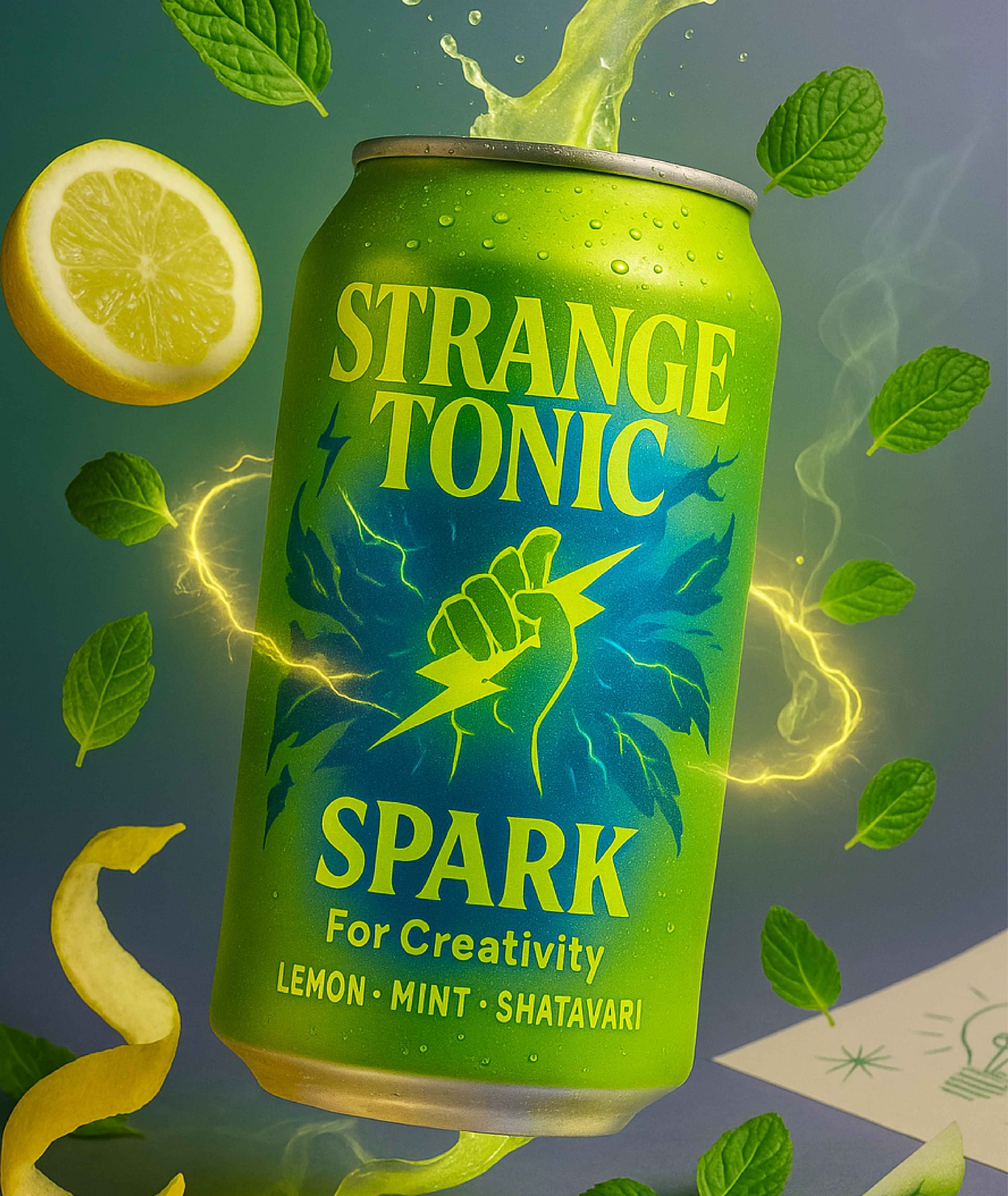
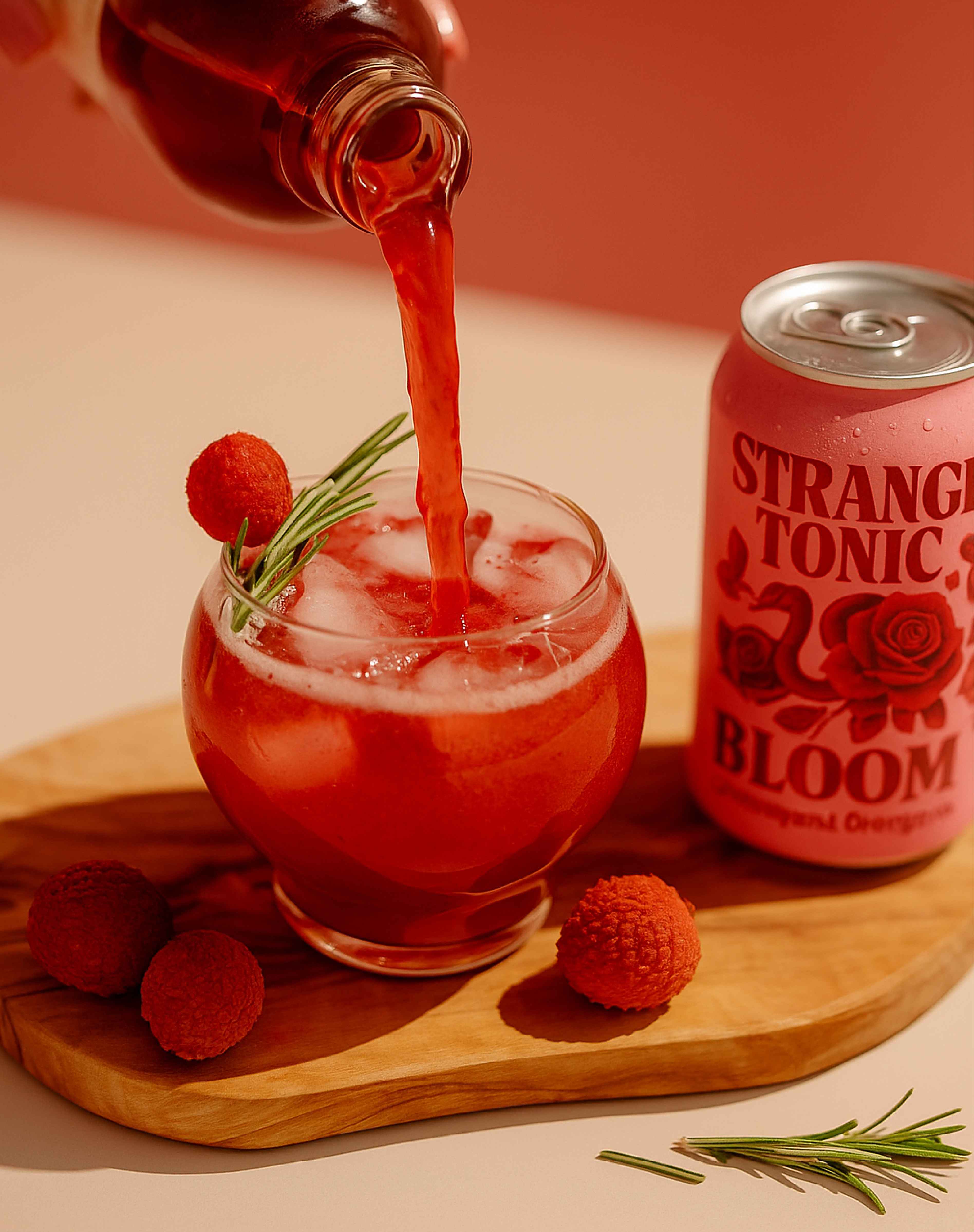
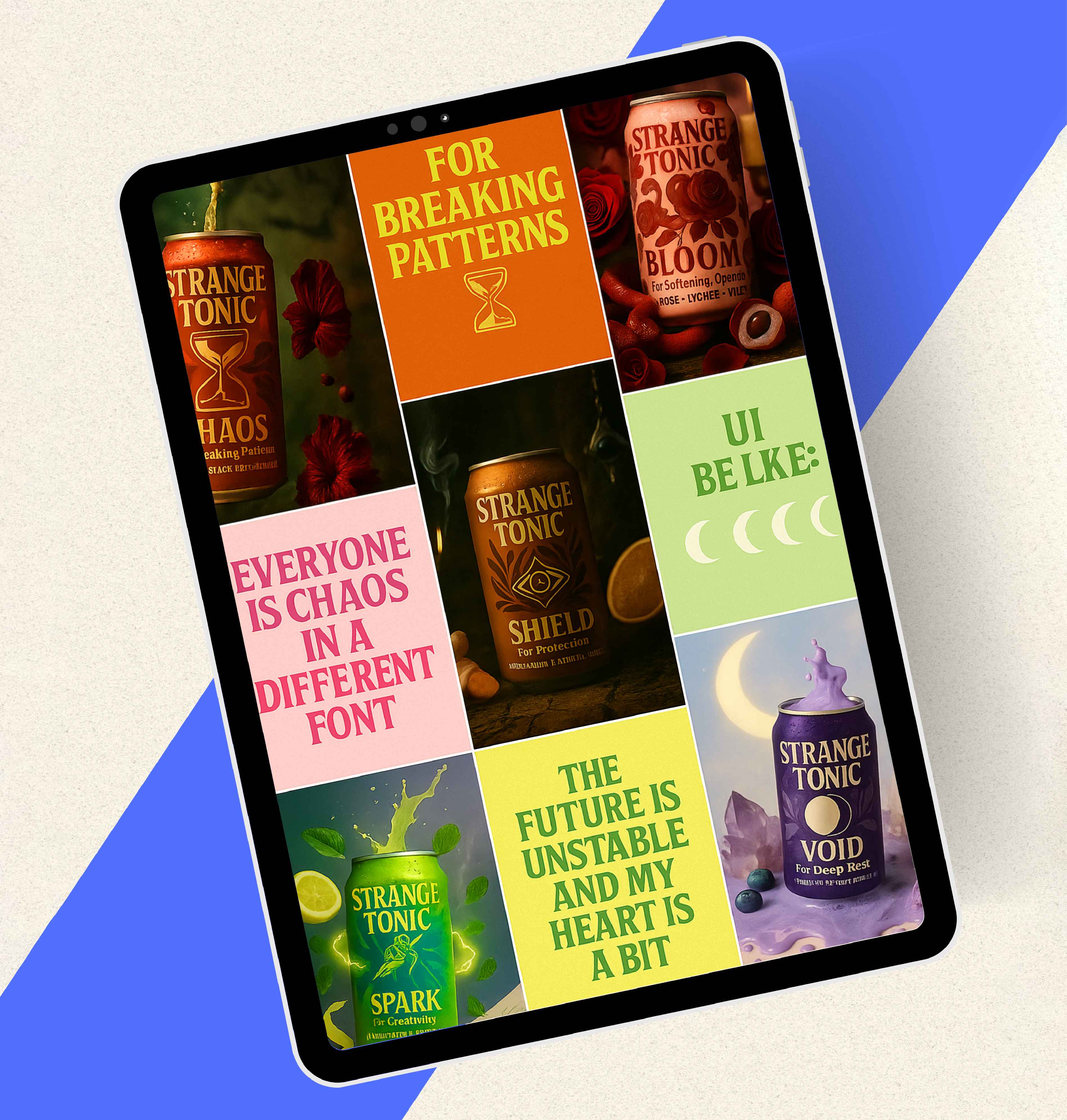
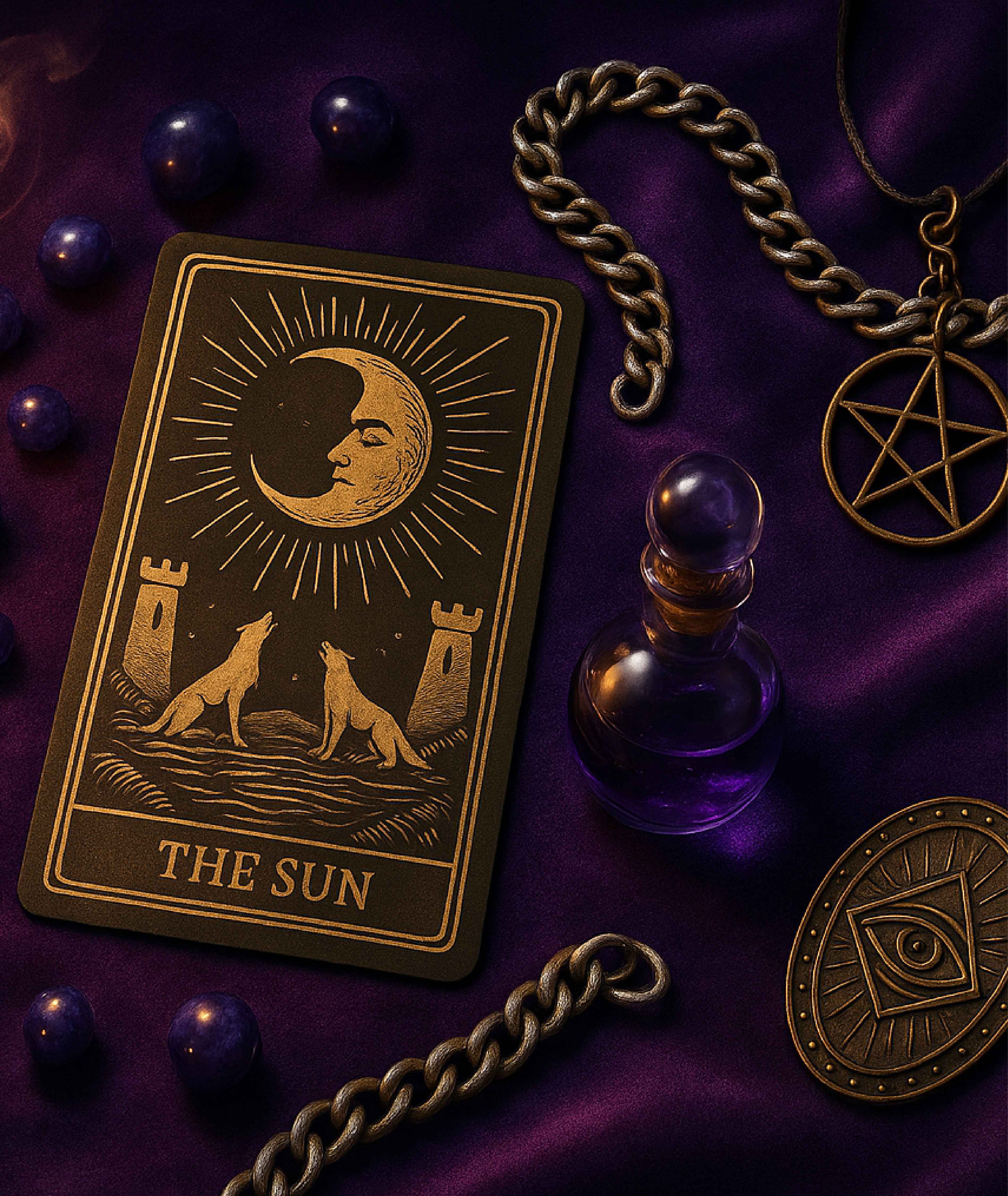
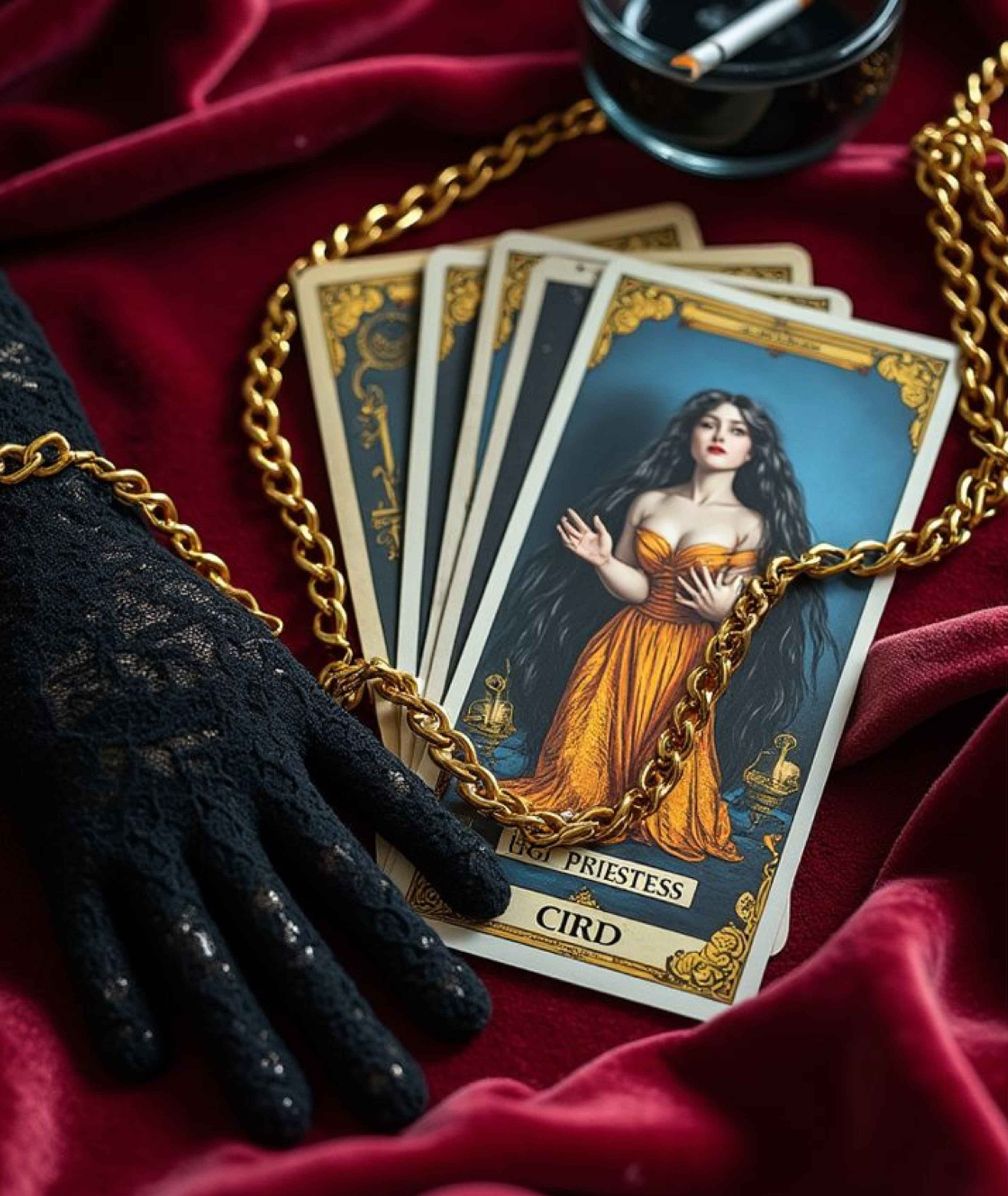
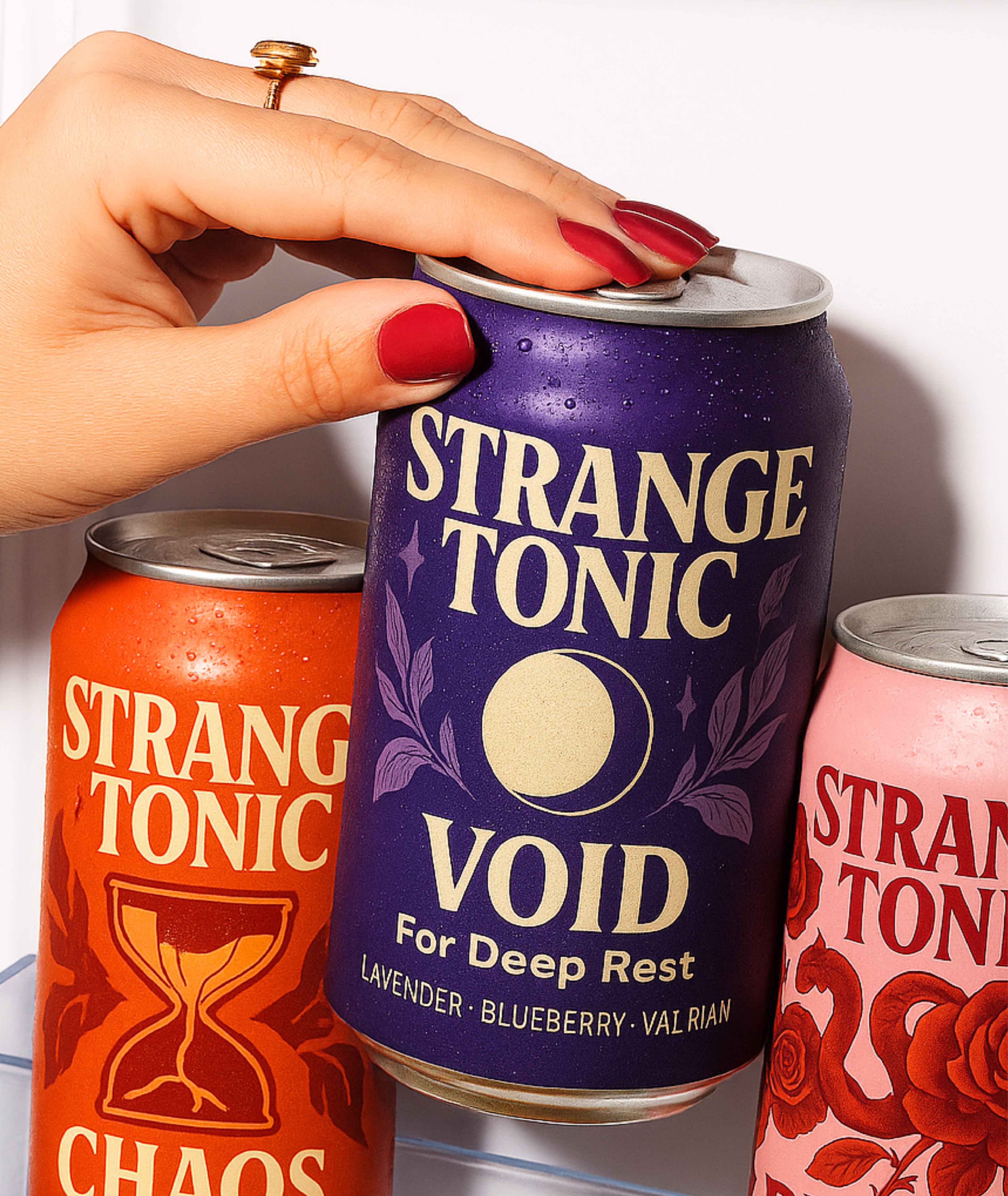
We built the brand around the idea of mood-based
drinking, rooted in tarot symbolism and celestial themes.
The visual identity used vivid color palettes, layered
illustrations, and moody graphics to reflect emotions
and
energy, not just flavor or function.
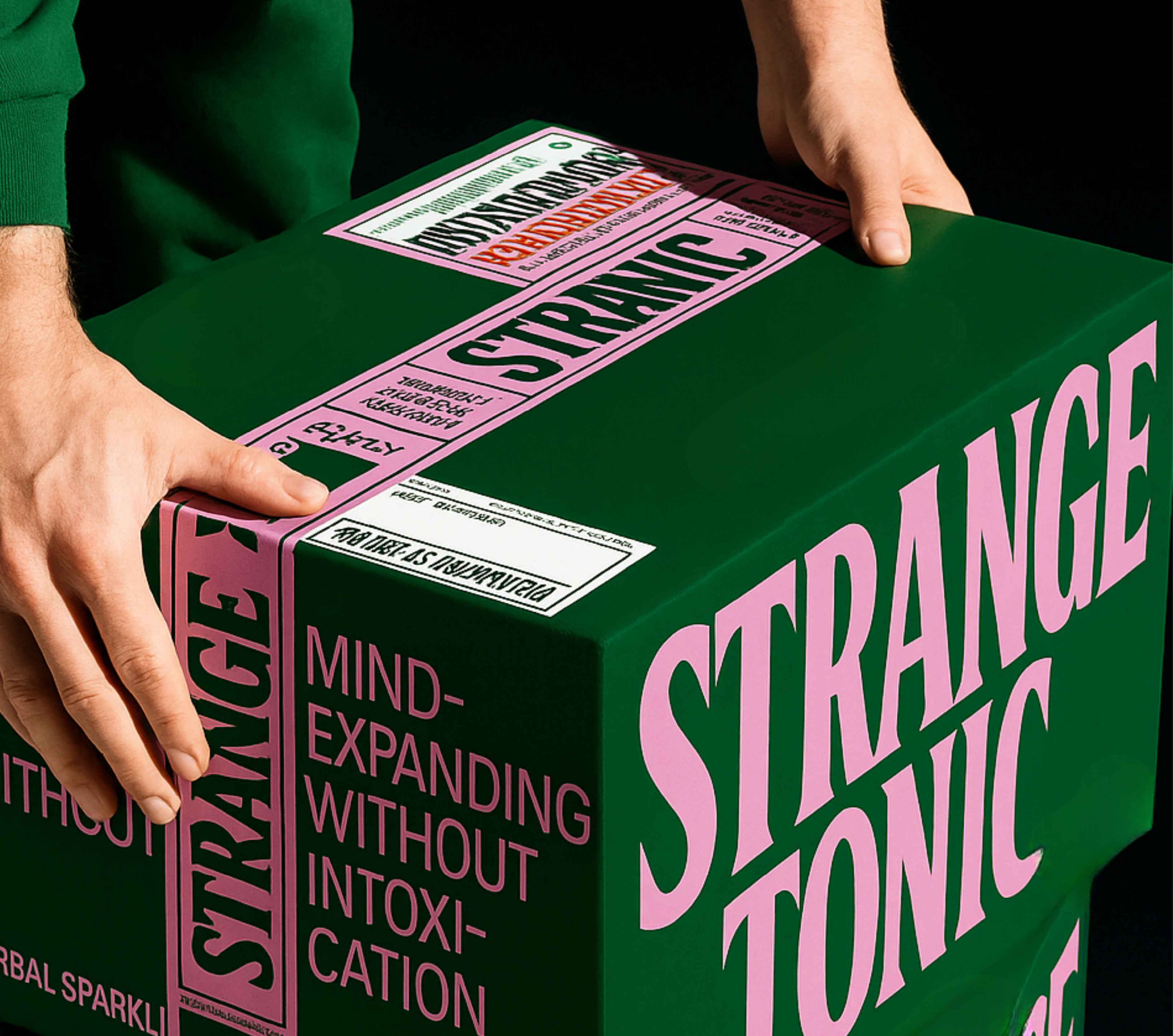
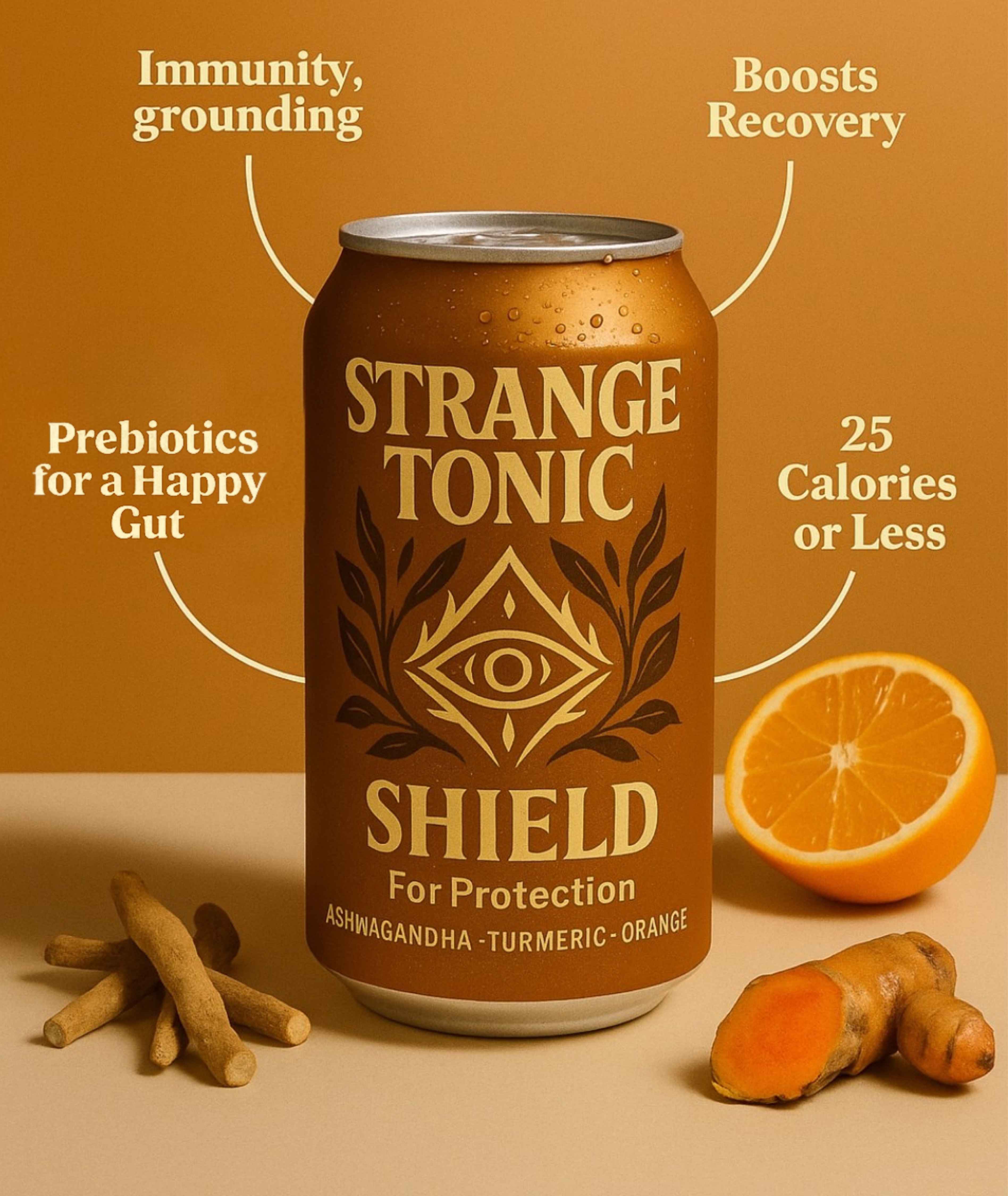
Packaging was designed to be collectible and immersive.
We created a full content system for e-commerce,
including detailed on-can graphics, ingredient visuals,
benefit callouts, and lifestyle mockups to help the
product shine on marketplaces like Amazon. We also
developed an Instagram grid direction and visual content
system tailored to Gen Z, with a mix of bold statements,
symbolic quotes, and magnetic visuals that matched
the
tone of the product. Strange Tonic isn’t just a drink; it’s a
branding that hits with energy and leaves a mark.